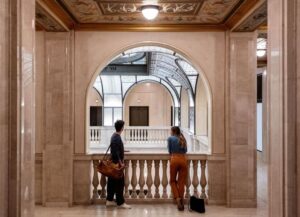
Detroit was a city renowned for its eye candy architecture. High rise palaces like the Fisher Building, or wild deco worlds like those of the Penobscot and Guardian Buildings, are twinkling jewels in the city’s skyline. There’s instant gratification in them, and it only takes one look at the rare marbles, bronze, elaborate sculpture work, intricate mosaics, and appealing design to recognize them as imposing works of art.
Then there are buildings among those that many feel mar the city’s grand skyline – large concrete monoliths like the Frank Murphy Hall of Justice or the rigorous Patrick McNamara Federal Building, for example. Crafted in the austere brutalism style in the 1960s, they’re the antithesis to the excess of Detroit’s jazz age and are reviled by their critics as aloof, claustrophobic, harsh, and uninviting.
After all, their main material is concrete, and the word “brutalism” comes from the French term béton-brut, or “raw concrete.” Mike Abrahamson, a University of Michigan architecture professor, historian, and the man behind the popular Tumblr page, Fuck Yeah Brutalism, sees the style as an extreme form of the mid-century aesthetic: “All the reasons people might not like modernism – it’s cold, impersonal – brutalism is an exaggerated version of that.”
However, brutalist buildings don’t face widespread criticism just for their material. Although the style was popular for urban renewal projects in metropolises’ darkest days during the 1960s and 1970s, the buildings usually failed to renew. It was also a common design found in government buildings, like the controversial Boston City Hall. “That was intended to express and represent the power of municipal government, and it makes people uncomfortable. When architecture is successful at doing that, it becomes unpopular,” Abrahamson says.
Regardless, there’s new appreciation for brutalism in recent years, and there’s a case to be made for the style’s aesthetic value, though finding the beauty in raw concrete can take a little work. Still, it’s worth the effort, and there’s no shortage of brutalist structures in Detroit to consider.
Perhaps the most infamous is the Frank Murphy, which is a frequent target of ridicule, likely due to its impact on the city’s skyline. Cranky armchair critics bemoan its heavy, thudding presence adjacent to Greektown and the Music Hall. Considered in that context, their gripes are understandable. The 12-story, concrete high-rise offers few windows in its middle-six floors where the structure’s courtrooms sit. Instead, concrete curtain walls jut, delineating the rooms, and the elevator shafts are defined in the Murphy’s middle and ends. There’s no ornamentation, no curves, and, on first glance, it’s a concrete horror with no visual value, but brutalism is deceptive like that. Frank Murphy isn’t – as one critic put it – “there to kill you.”
At the opposite, the western edge of downtown, the McNamara Federal Building provides a similar impact on the skyline. Completed by Smith, Hinchman & Grylls in 1976, the 27-story building and its angular, repetitive, geometrical composition rise over the decorative Washington Boulevard. Its recessed corners and sloping base provide the only deviation from the façade’s formula, and it’s crowned with large, concrete cubes. Like the Frank Murphy, the building’s uninviting air is increased by the presence of armed guards at the entrances. Perhaps the friendliest features are the concrete hammerhead sculptures in the McNamara’s plaza.
Though its exterior lacks the concrete that’s central to the style, the interior of the Renaissance Center, now called the GMRENCEN, held what was the most fascinating example of brutalism when completed in 1976. A “city within a city,” visitors navigated the cylindrical layout through inner and outer rings of concrete hallways, passageways, and skyways that led to office spaces and the building’s hotel. The core and outer rings present a labyrinth of concrete nooks and alcoves, while circular concrete balconies, terraces, and glass-less windows overlook the network. The combined effect is cinematic, something out of a dystopian sci-fi flick.
Sadly, as with so many brutalist buildings billed as urban renewal projects, the Renaissance Center failed to meet its objectives. Sitting on the Detroit River, the 73-story high-rise and its surrounding six towers seemed to ignore the waterfront and city around it. Critics leveled the usual charges – cold, fortress-like, and insular. It didn’t help that muggings occurred in the building’s dark, hidden concrete corners during the 1980s. When General Motors renovated the GMRENCEN in 2002, it “softened” the interior by installing a five-story glass and steel atrium that overlooks the waterfront. A good deal of concrete was removed, and the aesthetic is more in line with an airport terminal than an architectural masterpiece. In 2016, GM started further renovations and plans to erase more of the building’s brutalist character. Still, vestiges of the original concept will remain in the outer edges and are certainly worth a look.
Several blocks away, the Executive Plaza sits vacant and deteriorating, having last welcomed State of Michigan employees through its doors in 2002. Like the McNamara, the 11-story building is defined by its geometric, concrete façade. Protruding, grooved concrete rectangles frame the windows to form bays, and are free from ornamentation. Like other brutalist buildings, its shell delineates the elevator shafts and office space, and the building is supported by a series of two-story concrete pillars. Despite the recent gold rush on downtown Detroit buildings, the Executive Plaza failed to sell when its owner put it up for auction in 2015. In 1974, the state built an addition – a 22-story black box that also sits unused.
Architect Louis Rossetti’s Blue Cross/Blue Shield Building follows a similar formula to that of Executive Plaza and the McNamara, and, in classic brutalism fashion, is deceptively beautiful. It takes a minute before one recognizes the 22-story tower’s subtle, early 70s futuristic design.
On Wayne State’s campus, the Shapero School of Pharmacy Building is built-in the inverted pyramid design that seems to be popular for brutalist campus buildings. The Shapero is a product of Glen Paulsen, a former Eero Saarinen designer and president of the prestigious Cranbrook Academy of Art. While brutalism is typically associated with left-y social causes, architectural conspiracy theorists questioned whether the popularity of the Shapero design on college campuses were part of an evil aim. Crews completed the building in 1965, right around the age of student protest movements. As Slate recently theorized, the “fortress-like” buildings were there to protect against student siege. The idea is, of course, a little ridiculous, but that’s the sort of vilification brutalism endures.
Even if brutalist buildings are viewed by the majority as villains, the style is making something of a comeback. What’s behind that? Abrahamson attributes his blog’s popularity partly to the buildings’ being photogenic: “They look really sexy in black and white photographs. There’s something about the way exposed concrete shows up in black and white, the shadow effects, that looks great.”
Moreover, he adds that the buildings are approaching the end of their useful life, many haven’t been maintained properly, many are used differently than they were in the 1960s, and that means more brutalist buildings could go the way of the Renaissance Center.


